
Why Is Xcode So Antagonistic To Reduced Vision?

My eyesight is generally OK, but I have trouble reading small text, especially medium gray on light gray backgrounds. I usually code in 16 or even 18 point fonts, currently Atkinson Hyperlegible Mono. Every new release of Xcode makes seeing various UI elements harder, as if the designers all have 20/10 vision.
My eyes have a lot of floaters, and I wear progressive lenses, so looking up at tiny text is physically irritating. Otherwise, my vision is fine; I don't need any aids other than making the text a little bigger or having a little better contrast. I don't need assistance in any other application, or want to zoom text or use any of the other accessibility features, or change the resolution of the whole Mac just because Xcode chose poorly on text size.
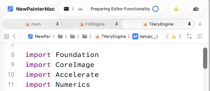
The latest version of Xcode, shipping with Tahoe, has several UI elements that are too small to be easily readable for me, even though my primary display is a nice Apple Studio Display. The tabs are the worst culprits. Inactive tabs are around a 50% gray on a 10% gray background. The font size appears to be 10 points, and the tab itself is 23 points high. In my experience, this is a ridiculous waste of space.
Apple does not support changing the size or font of UI elements in macOS. Accessibility has a feature that allows text size to be altered in applications that support it, but, of course, Xcode is not one of them. I don't understand why I can change the size of the navigation (the list of files) and the editor itself, but not the UI elements. There is no technical reason why the tabs and other UI elements, such as the source file navigation, can't be larger, or bolder, or blacker, or something. As I mentioned, the text only takes up 40% of the vertical space in a tab. My display is large, and this is not like trying to fit text on a Mac Plus screen in 1986.
I also use (and have used others in the past) PhpStorm and WebStorm from JetBrains. In those developer tools, I can adjust the UI elements to make things large enough to see what I am doing easily. Apple controls the Operating System, Xcode, and UIKit. There is no technical reason they can't have at least a little give on the UI element size. Some of the new icons have such a small hit box that you need perfect hand control to hit them (the little control on the tabs is only 8 pixels wide).
In my final job, designers would constantly give me designs (iOS) with poor contrast, usually medium gray on light gray. I continually ensured we implemented them with more contrast, and they never noticed, or at least never complained. Some designers love small, low-contrast text, maybe for aesthetic reasons, but there is no reason to make things harder for people to read, especially those with compromised vision. For some reason, the team responsible for our apps as a whole (my team had the single largest vertical piece, but nothing outside that) decided never to support user-controlled text size on iOS, likely because it made the designers' lives more difficult. Yet we did have to support other accessibility features for legal reasons.
Not everyone has perfect vision; designers should always consider a wide range of people's vision. JetBrains clearly considered UI flexibility to be an essential feature early on. Apple cares a lot about various accessibility features, but for some reason, not in Xcode. Perhaps the source code is such a mess (the codebase goes back to NeXT as far as I know) that they can't do much, but I find that difficult to accept with their resources.
I would be happy if I could pick a different font for those tiny elements, even at the expense of losing horizontal space, as an option (since many of you can see better than I can!). That shouldn't be hard to implement, given that they control everything from the bare metal to macOS.
Sadly, I no longer know anyone at Apple I could complain to (I worked there 30 years ago for half a year).